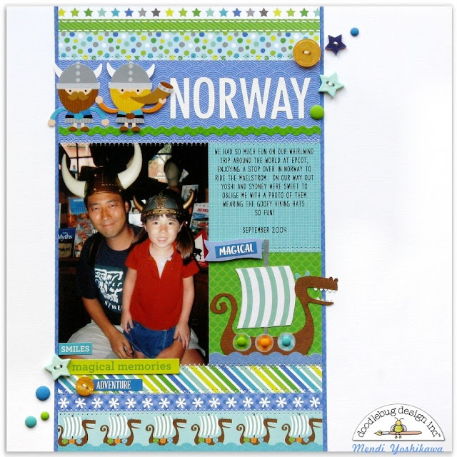
I cut many of the borders from the Dragon Dots Paper, pairing them with several other prints from the collection to form my 7-inch wide column down the left-hand side of my page. To give my layout some extra oomph I decided to add some zig-zag stitching between the blocks on my sewing machine. When I was done I embellished my title block using my favorite Skinny Alphabet Stickers, along with a ric-rac border sticker from the this & that 12x12 sticker sheet and two of the darling vikings from the icon sticker sheet. Afterwards I adhered some buttons and matte sprinkles in a random pattern to lend a bit of whimsy.
To balance out my grouping in the top right corner, I also wanted to add a little something to the bottom left so I used some word stickers from the This & That sticker sheet, along with some more buttons and sprinkles. I am frequently drawn to the clean look of grid designs, but I think it's always fun to have a few things protrude from the edges to keep things from looking too static.
When I was done with my layout, I had a few scraps cut off from my borders that would otherwise end up in the waste paper bin so I thought why not whip together a quick card with them using my scrapbook page as inspiration. I paired them with a viking from the icon stickers, a word bubble from the This & That stickers and a cupcake sprinkle shape. I love that I now have a card to grab on the way out the door to a birthday party the next time I need one and it only took me a few extra minutes while my other supplies were already out.
Thanks so much for visiting today. I hope I've inspired you to make a few cards with your Doodlebug scraps the next time you have finished a layout. It feels so good to put them to good use and to have a couple adorable cards ready to go in the process.


So cute! Perfect picture!
ReplyDeleteI am in love with this collection!!! We actually went to Norway (I'm Norwegian, too!) a couple of years ago---I need this collection
ReplyDelete